Why This Market Looks More "Dotcom" than "GFC"
Some thoughts from a week in the volatility rabbit hole
Is the S&P 500 going to crash and, if so, what will be the knock-on effects for the economy?
That is NOT the question I was thinking about last week. Instead, I was working on an idea for our follow-up book to Rise of Carry. The idea was this:
Carry traders provide liquidity and sell volatility. When central banks intervene to support markets after a crash (2008, 2020) they do the same thing - basically they replace unstable private carry trades with massive public carry trades. By selling volatility indirectly, they stabilize markets.
Should they do the opposite when when volatility is ‘too low’? Should they inject volatility into the market to curtail the build-up of private carry trades? This would introduce more short-term risk but could make markets and the economy safer in the long-term by reducing the scale of big crashes.
I’m certainly not the first person to have this idea, but our theory of carry as the dominant driver of market behavior gives an important new reason why ‘too low’ volatility is destabilizing. Anyway, as I researched this idea I fell into a few rabbit holes, and I’ve spent the last week digging out. Yet behold…as I emerge back into the light, I bring with me some interesting graphs.
I entered the first rabbit hole innocently enough. My question: was volatility unusually low prior to past carry crashes? That seemed safe-enough to explore, but I soon got diverted down side tunnels related to questions like - volatility of what asset classes? Over what time horizon? How do you compare them? Each question involved additional detours related to data collection, cleansing, etc. It got dark.
In order to get out of the holes and back to the surface I decided to simplify and focus on three measures: S&P 500 implied vol (VIX), government bond implied vol (MOVE) and BBB credit spreads1. But these measures all have different scales, so they aren’t easily comparable. Also, the economy has evolved a lot over time so deciding what a ‘normal level’ for each is tricky.
I dealt with these issues by calculating percentile distributions for each measure over rolling 10-year windows. For example, if today’s credit spread is the lowest its been in the last 10 years, it gets a score of 1. If today’s spread is the highest its been in the past decade, it gets a score of 100. These rolling percentiles allows the different vol measures to be compared in the same units and gives us a sense of how normal things were at each point in time relative to the preceding decade.
That still yields a messy graph, so I went a step further and invented a definition for high and low volatility regimes. I labelled any number 25 or lower as ‘low vol’ and any reading 75 or higher ‘high vol’. Basically, if the VIX, MOVE or credit spread is in the bottom quartile of the distribution over the last 10 years, I consider that to be a low volatility environment and assign it a score of -1. Readings in the top quartile are high volatility regimes and get a +1. Every other reading is 0.
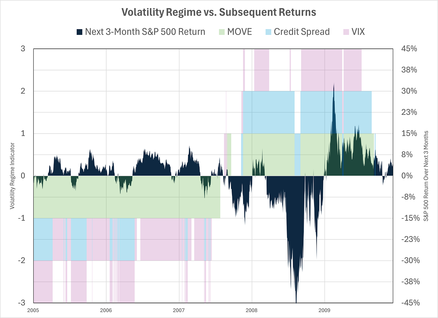
Then I plotted those scores together for different episodes of market distress. I wanted to see if big market crashes were preceded by low vol regimes. Here’s the graph for the GFC, which I show first because it’s the best!
The years leading up to the GFC were exceedingly calm . Government bonds (green) were in a low vol state every day from 2005 through mid-2007. Equity vol (pink) was mostly low and credit spreads were either low or neutral. The Great Moderation. Only it wasn’t the great moderation - it was the Carry Regime. Remember carry traders sell vol, so as the size and scope of their activity builds it suppresses vol until...something triggers a fall big enough to cause those trades to unwind and we move to a high vol state.
The next graph is Covid. Not quite as ‘perfect’ as the GFC but still multiple years of low vol - and very few episodes of high vol - leading up to a 20% drawdown in late 2018 and then the ‘Big One’ in 2020.
The third graph is the LTCM crisis in 1998. The relationship is not as strong, but again we still see an extended period of very low credit spreads (blue). About 25% of the time before the 1998 crash two indicators were in a low vol state. There were no periods in the years immediately beforehand where two indicators were in high vol territory. The crash itself was not as dramatic, but remember the magnitude of carry trades was smaller, therefore the impact of the vol spike was not on the scale as the GFC or Covid.
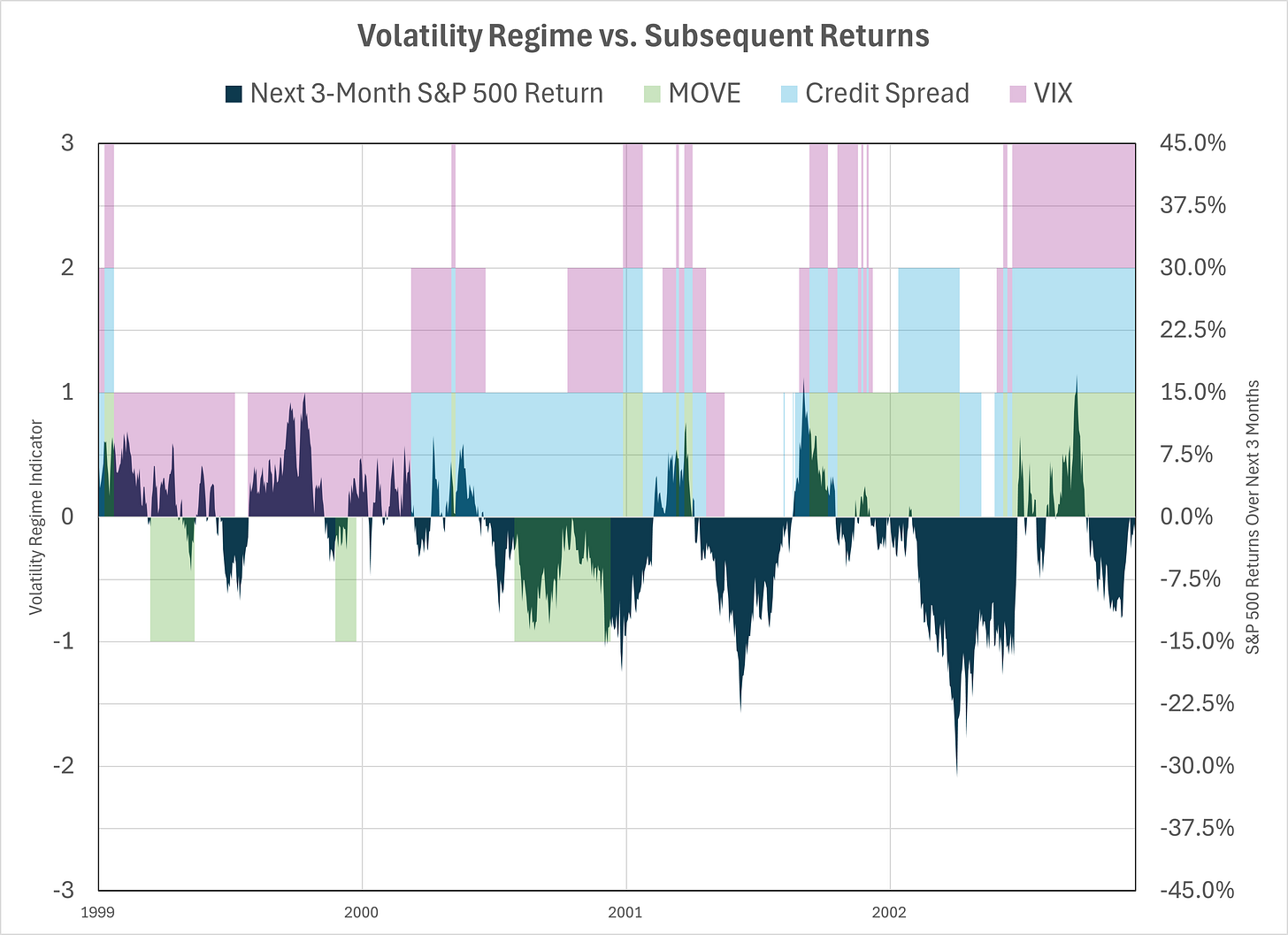
I then looked at the bursting of the Dotcom bubble. In the Rise of Carry we didn’t identify this as a classic carry crash because it isn’t clear that it was driven by an unwind of levered trading. It was more like a modern Tulip mania focused on early internet and telecom stocks, but primarily driven by excessive new issuance at inflated prices.
Indeed it looks quite different than the other episodes from a vol perspective. The first big drawdown hits in late 2000 but that was preceded by a period of normal-to-elevated vol. There were other nasty episodes in early 2001 and 2002. That did trigger a recession and unemployment rose from 4% to 6%, but there was no financial crisis. During that time I quit my steady job and started a business and don’t remember anyone saying “wow, you’re brave to start a business during this recession”.
The last graph is where we are now. The S&P 500 has rallied to very expensive valuation levels but this has not happened against a backdrop of persistently low vol. For a time in 2024 it started to look like that - both VIX and credit spread were in ‘low vol’ regimes during the summer. But the yen carry crash sent the VIX back to more normal levels. Bond implied vol has been elevated for almost three years.
I guess the strap line from all of this is that, at least from a volatility perspective, the situation today looks more like the Dotcom environment that the GFC. Maybe that means we’re more likely to experience sporadic pull backs over an extended period rather than the earthquakes that hit in 2008 and 2020? These could easily be famous last words. There may be enough hidden leverage in the system that a S&P 500 drawdown of 20% could trigger a financial crisis.
Here’s a quick summary that compares valuation levels on the eve of each of these periods of market distress.
The right two columns are simple valuation metrics. The first is the spread between the real earnings yield and the real bond yield. The second is my measure of the additional risk premium the market is offering equity investors relative to bond investors. It’s interesting that on both these measures equities did not appear to be in ‘bubble’ territory prior to the big GFC/Covid crashes. I think that is consistent with those events being more driven by system-wide deleveraging and a subsequent dash for cash.
I don’t have a snappy conclusion! But I thought these graphs were interesting enough to share and maybe justify my week-long detour through the various rabbit holes that produced them.
Paid subscribers be on the lookout for an email with all the underlying data, so you can explore rabbit holes on your own.
You Might Also Like:
Digital Money Is Coming And It Won't Be Bitcoin
A simple mental model of credit spreads is that they the are like selling a put option where the underlying is the value of the firm’s assets. Selling a put is being short volatility which is one reason why it makes sense to include credit spreads alongside the VIX and MOVE index in this analysis.


“It got dark” made be burst out laughing
seems like MOVE is more predictive than VIX … do you agree?